You can select specific fields from those available in the desktop version to add to the Detailed Form Editor. Each time you add or remove a field, changes will be made automatically to the WYSIWYG editor. This allows you to make small modifications, check your work, and see what else is needed to customize your form.
Note: Fields that are required in your Desktop application (such as Category on Work Orders) will be forced onto the form by the Lucity Administration for Web Apps. These fields cannot be removed; however, they can be hidden using the component property settings.
To add fields to the Detailed Form Editor, click the button on the toolbar at the top of the dialog. The list of available fields will appear.
These fields differ depending on which program, module, and component you chose in the Form Manager.
If you have changed the default field names in your desktop version, your custom names will appear in this list.
To select fields, click on the field names in the list.
You can choose as many or as few fields as you wish to be included on your custom form; however, each individual field can only be added once per form.
As you highlight each field in the list, a brief description will appear at the bottom of the dialog. This description displays the field name, component type, and default Lucity caption.
Click the OK button to close the list of fields and add the selected fields to the WYSIWYG editor.
Alternatively, click the Cancel button to close the list of fields without making changes to the WYSIWYG editor.
Note: When you click the button again to add additional fields, only fields not currently added to the WYSIWYG editor will appear in the list.
The system will place the fields on the form in the order in which you selected them in the Add Fields dialog. To change the arrangement of the fields on the form, place your mouse over the handle beside the field name. Your cursor shape will change, allowing you to drag and drop the field to the location you'd like.
Fields can be placed anywhere on the form; the form size will adjust automatically to accommodate field placement.
To change a field's label text simply click on the label. A text box will appear allowing you to type directly in the WYSIWYG editor.
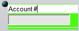
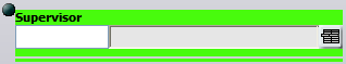
Note: Currently selected fields are highlighted in bright green.
You can also click on the field itself to test how data is entered. This lets you see how pick lists are used, among other things. Depending on the type of component and or control selected in the properties dialog, different types of data entry will be allowed.
Note: If secured fields have been added to a form, they will be displayed only for users with rights to view secured fields granted in the Security.exe. Examples of secured fields include employee's hourly rates.
Click the button to display the form details. This allows you to customize each field's properties as need. Follow the link for additional information.
Note that several types of fields have additional special functions (knowledge base, scripts, etc.). These fields are described in the following topics. Follow the links for additional information.
 button on the toolbar at the top of the dialog. The list of available fields will appear.
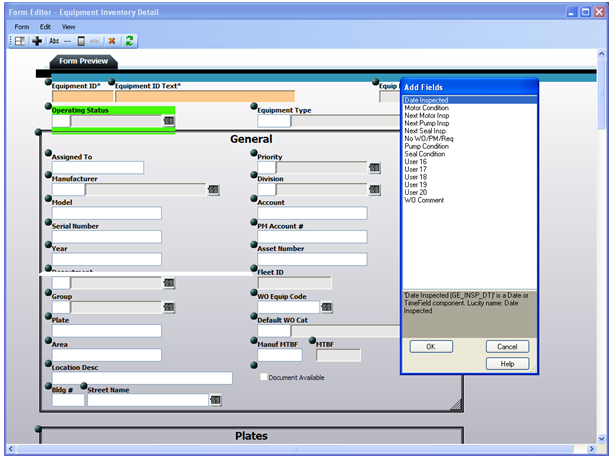
 beside the field name. Your cursor shape will change, allowing you to drag and drop the field to the location you'd like.
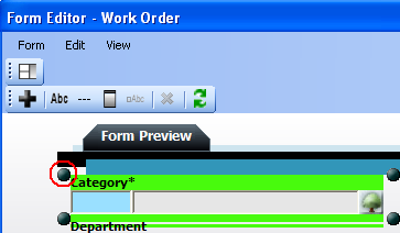
 button to display the form details. This allows you to customize each field's properties as need. Follow the link for additional information.