The Form Details window lists all fields and components currently included on the form and identifies each field or component's properties. You can use this window to customize the properties as needed.
Click the button to show or hide the details window.
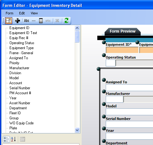
The top half of the details window lists all fields and components currently included on the form in the order that they appear. As you move fields and components in the WYSIWYG editor the list order will change automatically.
Select a field or other component on the form by either clicking on its name in the list or clicking on its location on the form. The selected component will be highlighted in bright green (see image below).
The properties displayed will change depending on which component is selected. These properties allow you to make fields read-only or required, include default values, re-label fields and components, resize fields and components, and much more. Definitions are provided for all available properties. Consider the following when making changes:
Default Values - If a default value is designated in your desktop application, it will NOT appear in the properties dialog; however, if no default value is entered here, the default value from your desktop application will appear on the web form when it is run. Any default values entered here will not affect your desktop application.
Required Fields - If you make a field required on this form it will not affect your desktop application; however, if a field is required in your desktop application it will be forced onto the form by the Lucity Administration for Web Apps and will also be required on the web. Required fields will be identified with an asterisk (*) and a different background color. An error message will be displayed if users attempt to submit a form without data in these required fields.
Pick Lists - When you include a pick list field on the form you'll need to select the type of data entry allowed (using the Control Type property). You can elect for users to type data into a field or select from a list. An error message will be displayed if an invalid submission is entered into one of these fields.
Changes made to each component's properties will appear automatically in the WYSIWYG editor. This allows you to make small modifications, check your work, and see what else is needed to customize your form.
 button to show or hide the details window.