
 Print
Print
|
|
|
|
|
Default Form Elements
While each of the forms on this website is customizable, the following form elements appear on many different types of detail forms. These are described below.
Form Element |
Use and Location |
Form Name |
This appears in a tab at the top of the screen. |
Submit Button |
This will always appear centered at the bottom of the Request submittal forms. Once you have finished entering data into the fields on the form, click the Submit button to submit your request. Note: For information on what happens after clicking the Submit button, follow the Request Submission link. |
Pick Lists |
The type of data that you can enter into pick lists has been determined by your system administrator. If an invalid submission is entered into one of these fields, an error message will appear. |
Default Values |
Certain fields have been given default values by your system administrator. These field will appear with data already filled in on the form. You will not be able to change the data in these fields. |
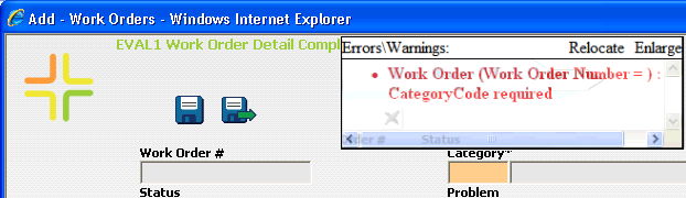
Required Fields |
These fields are identified with an asterisk (*) and a different background color. A warning message will be displayed if you attempt to submit a form without data in these required fields. A sample warning message is displayed below: |
See Also |
Print
| © Lucity, Inc. All rights reserved. |
|