The Form Preview is where most of the form editing takes place. Within this window users can select components to edit properties, move components, change labels, and test field functionality (in a limited manner)
Form Components |
|
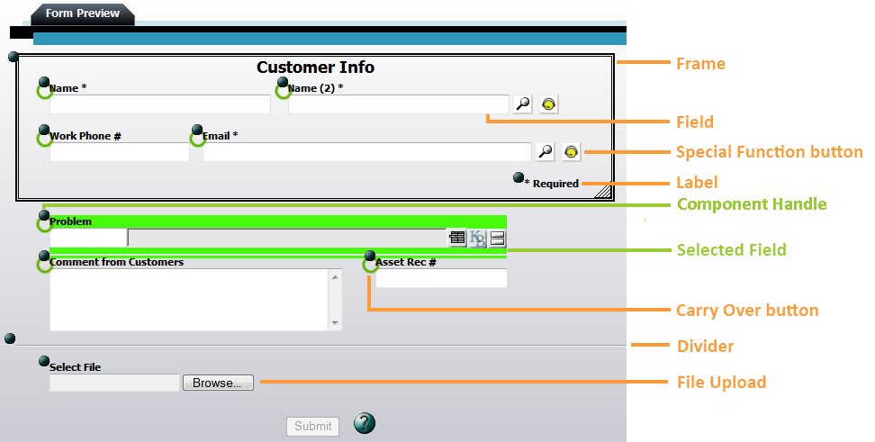
Fields |
Displays the list of available fields to choose from, then adds the selected field to the form. Fields display attribute data from the module. |
Label |
Adds a label component to the form. Labels are a way to add text or notes directly into the form. |
Divider |
This adds a horizontal line that visually breaks up the form. |
Frame |
Adds a a boxed section to the form. Frames are used to group together similar fields. When a frame is moved all the components are moved with it. |
Behavior |
Adds a behavior component to the form. This can be used to add a 'Remember Me' or 'Use Requestor's Address' checkbox. Note: This option is only available on Request submittal forms. |
File Upload |
Allows the designer to enter upload dialog boxes to the form. This kind of box allows users to attach a file to the record and upload it to the server. |
Spacial Function Field |
These buttons are automatically added with certain fields. Click on them to see how they function. Examples of special functions |
Editing Tools |
|
Component Handle |
These solid dark circles allow users to control the position of a component in the form preview. Click the control and drag it to move the field, label, etc... to the desired location. |
Selected Field |
When a field or other component is selected it is highlighted in bright green. |