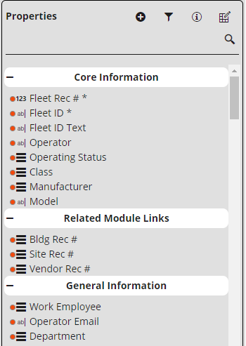
Each Lucity module contains a series of fields that store information about a record. Each type of field can accept different types of information and therefore has different uses. On a form the fields are represented by properties. Each property represents one or more fields and has settings that modify how the property behaves.
Tools
|
Add Property |
Adds the selected property to the form. The associated fields will automatically be positioned below the currently selected component. |
|
Property Groups |
Enables users to switch how the properties are grouped together and sorted. The following options are available: Grouping options
Sorting options
|
|
Display Information |
Displays the database field names and masks next to the fields. |
|
Component Information |
Displays a pop-up window that displays information about a selected component and enables the user to edit the component's settings. More information about the Component Information pop-up
|
Property Types
|
Type |
Description |
Mask Example |
|
Checkbox |
Checkboxes, also called Boolean fields, are used to indicate that a data type has only two possible values. |
n/a |
|
Date |
Date fields store a calendar date. These are often grouped with a Time field. |
mm/dd/yyyy |
|
Time |
Time fields a time of day. These are often grouped with a Date field. |
hh:mm am |
|
Integer |
Stores whole number. The size of the possible number varies from field to field. |
nnnn nnnnnnnn |
|
Double |
Stores a positive or negative number including decimal places. The number of digits supported varies by field. |
-nnnnnnnnn.nn |
|
Text |
Stores text and numbers. The number of characters supported varies by field. |
25x |
|
Picklist |
A pair of fields that store a code and description. The values entered into this field are selected from a list. The code portion iof the field may be a number or text depending on the field. |
nnn/25x 5x/50x |
Fields on form
Fields that are included on the form are marked with a green dot.
Field Properties
The fields added to the form can have their field properties set in the Component Information Pop-up. These properties are specific to the selected field on the current form. Fields in Lucity have 3 levels of field properties. There are properties set by Lucity, there are properties set globally, and there are properties set on a form. The properties are honored in order of heirarchy. If Lucity sets a property then it cannot be over ridden by other properties. If a property is set Globally it cannot be over ridden by the form.
Lucity Properties |
These are overarching properties that affect all users no matter what and cannot be changed. For example the Category field is required for a work order record. If a field property is set by Lucity the Component Information pop-up will contain a note in red. |
Global Properties |
These are overarching properties that affect all users and are set by an administrator. For example an organization wants all work orders to include a supervisor. Global Field Properties are set using the Fields Properties tool in Form Toolbar. |
Form Field Properties |
These are specific properties that affect only users that are using the form the field property was set on. For example the water department wants to require users to fill out a specific field that no other department uses. |
Note: Field Properties affect both the field on the form but also the field when it appears in a toolkit.

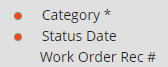
Checkboxes, also called Boolean fields, are used to indicate that a data type has only two possible values.
Example: The work order is Hard Locked or it is not.
Checkbox Field Component Information
Use the  Component Information pop-up to edit the field's properties.
Property Name |
Identifies the property associated with this field. This relationship helps third-party developers correlate form data with the properties available in the back-end. |
Label |
Sets the text that will be displayed on the form. |
Hidden |
Indicates that the field should be hidden. This is useful for simplying forms while still setting a default values for the field. |
Read Only |
Designates the field as read-only, which prevents the user from entering data on this form. |
Carry Over |
Enables/disables the green Carry Over button for the selected field. To prevent users from seeing Carry Over buttons throughout the entire form, the grid the form is attached to must be edited to hide the Display Carry Over Buttons button. More details
|
Default Value |
Determines whether the checkbox is marked automatically when a new record is created. Unless the field is marked as read-only, the user can overwrite the default before submitting the form. |


Date/Time fields store a calendar date or time of day. These types of fields are often grouped together.
Example:
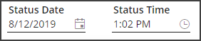
Date/Time Field Component Information
Use the Component Information pop-up to edit the field's properties.
Property Name |
Identifies the property associated with this field. This relationship helps third-party developers correlate form data with the properties available in the back-end. |
Label |
Sets the text that will be displayed on the form. |
Hidden |
Indicates that the field should be hidden. This is useful for simplying forms while still setting a default values for the field. |
Required |
Forces the user to enter information in this field in order to save the record.
|
Read Only |
Designates the field as read-only, which prevents the user from entering data on this form. |
Carry Over |
Enables/disables the green Carry Over button for the selected field. To prevent users from seeing Carry Over buttons throughout the entire form, the grid the form is attached to must be edited to hide the Display Carry Over Buttons button. More details
|
Default Value to Now |
When enabled, uses the current date or time as the default when a new record is created. Unless the field is marked as read-only, the user can overwrite the default before submitting the form. |
Default Value |
Establishes a date or time to be used when a new record is created. Unless the field is marked as read-only, the user can overwrite the default before submitting the form. |


Number fields only allow users to enter numerical values. Depending on the field properties, numbers may or may not be permitted to contain negatives or decimals.
Example: The first box in an Address field only allows users to enter a street number.

Number Field Component Information
Use the Component Information pop-up to edit the field's properties.
Property Name |
Identifies the property associated with the field(s). This relationship helps third-party developers correlate form data with the properties available in the back-end. |
Label |
Sets the text that will be displayed on the form. |
Hidden |
Indicates that the field should be hidden. This is useful for simplying forms while still setting a default values for the field. |
Required |
Forces the user to enter information in this field in order to save the record.
|
Read Only |
Designates the field as read-only, which prevents the user from entering data on this form. |
Carry Over |
Enables/disables the green Carry Over button for the selected field. To prevent users from seeing Carry Over buttons throughout the entire form, the grid the form is attached to must be edited to hide the Display Carry Over Buttons button. More details
|
Width |
Sets the width of the field. This is automatically changed when the field component is adjusted in the Form Layout Editor. |
Max Value |
Sets a limit for the largest value a user may enter in this field. Leave this field blank to provide for no upper limit. |
Min Value |
Sets a limit for the smallest value a user may enter in this field. Leave this field blank to provide for no lower limit. |
Decimal Depth |
Sets the number of digits allowed after the decimal point. |
Default Value |
Determines what value will automatically appear in this field when a new record is created using this form. Unless the field is marked as read-only, the user can overwrite the default before submitting the form. |

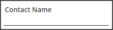
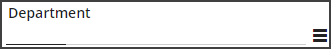
Text fields allow users to enter letters and/or numbers in these fields. Lucity text fields vary from four to 100+ characters in length.
Example: Contact Name fields, Comment fields, etc.
Text Field Component Information
Use the Component Information pop-up to edit the field's properties.
Property Name |
Identifies the property associated with the field(s). This relationship helps third-party developers correlate form data with the properties available in the back-end. |
Label |
Sets the text that will be displayed on the form. |
Hidden |
Indicates that the field should be hidden. This is useful for simplying forms while still setting a default values for the field. |
Required |
Forces the user to enter information in this field in order to save the record.
|
Read Only |
Designates the field as read-only, which prevents the user from entering data on this form. |
Carry Over |
Enables/disables the green Carry Over button for the selected field. To prevent users from seeing Carry Over buttons throughout the entire form, the grid the form is attached to must be edited to hide the Display Carry Over Buttons button. More details
|
Width |
Sets the width of the field. This is automatically changed when the field component is adjusted in the Form Layout Editor. |
Max Length |
Displays the number of characters allowed in the field. |
Height |
Sets the height of the field. This is automatically changed when the field component is adjusted in the Form Layout Editor. |

Picklists allow users to select a value from a predefined list. Lucity picklists often consist of two fields: One contains a Code and the other a Description or Type. Sometimes the available values are carried over from another module (e.g., assets lists, resource options, locations, etc.).
Example
Codes
The code portion of a picklist field can either be a number or text field.
Selectable Values
The values users can select in picklists come from one of two sources:
PickList Appearance


button next to the description. Enter the code and exit the field to automatically populate the description, or, click the button to view a pop-up window of options.
Picklist Field Component Information
Use the Component Information pop-up to edit the field's properties. The pop-up will display the properties for the code part of the picklist, the type part of the picklist, and properties that affect both.
Property Name |
Identifies the property associated with the field(s). This relationship helps third-party developers correlate form data with the properties available in the back-end. |
Label |
Sets the text that will be displayed on the form. |
Hidden |
Indicates that the field should be hidden. This is useful for simplying forms while still setting a default values for the field. |
Required |
Forces the user to enter information in this field in order to save the record.
|
Readonly |
Designates the field as read-only, which prevents the user from entering data on this form. |
Carry Over |
Enables/disables the green Carry Over button for the selected field. To prevent users from seeing Carry Over buttons throughout the entire form, the grid the form is attached to must be edited to hide the Display Carry Over Buttons button. More details
|
Component Type |
Indicates the picklist style displayed on the form. |
Tree Display |
Only appears when the Component Type is Site Picklist, Building Picklist, or Park Picklist. Makes the Asset Rec # field's pop-up an asset driven list that controls whether the asset tree identifies the assets using the Code, Type, or Both. |
Tree Filter |
Only appears when the Component Type is Site Picklist, Building Picklist, or Park Picklist. Enables an administrator to type in a sql statement to narrow down the list of records at the top teir of the asset tree. |
Limit List |
Opens the limit list dialog which enables the user to control which picklist values are available for the selected field. |


