Component Information Pop-up
![]()
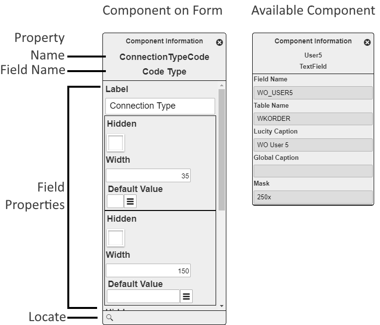
The Component Information pop-up appears at the top of the Form Design Mode pane and displays the properties for the component. When a component is available but has not been added to the form, this dialog is read-only. When the component has been added to the form, this dialog provides a place to edit the component's properties.
- For Basic Components this tool enables administrators to control the component's settings.
- For Advanced Components and Properties this tool enables administrators to control the field properties that will apply to the field on this form.

|
Property Name |
Identifies the property associated with this field. This relationship helps third-party developers correlate form data with the properties available in the back-end. |
|
|
Field Type / Component Type |
Basic components display whether the component is a Label, Frame, or Break. Property components display the type of data stored in the field. ex. Text, Date, Time, Number, etc... |
|
|
Component Properties |
The properties that control how the component appears or behaves on the form. |
|
|
|
Locate |
Displays the selected component in the Form Layout Designer. |
Common Component Settings
The following are examples of some of the properties that can be set for most component types. For a complete list of available settings review the pages about specific components.
|
Label |
The text that is displayed with a component. |
|
Width |
The horizontal area the component takes up. This can often be adjusted directly in the Form Layout Designer. |
|
Height |
The vertical area the component takes up. This can often be adjusted directly in the Form Layout Designer. |
More information about properties (fields)