
The Component Information Pop-up appears over the Design Mode and displays the properties for the component. For Basic Components this enables administrators to control the component's settings. For Advanced Components and Properties this enables administrators to control the field properties that will apply to the field on this form.
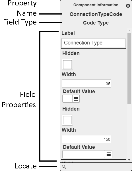
Property Name |
Identifies the property associated with this field. This relationship helps third-party developers correlate form data with the properties available in the back-end. |
|
Field Type / Component Type |
Basic components display whether the component is a Label, Frame, or Break. Property components display the type of data stored in the field. ex. Text, Date, Time, Number, etc... |
|
Component Properties |
The properties that control how the component appears or behaves on the form. |
|
|
Locate |
Displays the selected component in the Form Layout Designer. |
Common Component Settings
The following are examples of some of the properties that can be set for most component types. For a complete list of available settings review the pages about specifc components.
Label |
The text that is displayed with a component. |
Width |
The horizontal area the component takes up. This can often be adjusted directly in the Form Layout Designer. |
Height |
The vertical area the component takes up. This can often be adjusted directly in the Form Layout Designer. |
