There are several types of form fields that enable users to view or edit Lucity records. This pages provides an overview of these fields and how to navigate through them.
Checkbox Fields
Checkboxes, also called Boolean fields, are used to indicate that a data type has only two possible values.
Example:
The work order is Hard Locked or it is not.
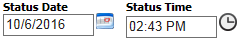
Date/Time Fields
Date/Time fields store a calendar date or time of day. These types of fields are often grouped together.
To manually enter a date, type the date in the the mm/dd/year format.
Use the Calendar and Clock buttons (see example, below) to select the date or time from a pop-up widget.
To automatically enter the current date, click inside the field and press the space bar. The system supplies the current date/time.
Example:
Number Fields
Number fields only allow users to enter numerical values. Depending on the field properties, numbers may or may not be permitted to contain decimals.
Example: The first box in an Address field only allows users to enter a street number.
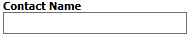
Text Fields
Text fields are often alphanumeric: that is, users may enter letters and/or numbers in these fields. Lucity text fields vary from four to 100+ characters in length.
Example:
Contact Name fields, Comment fields, etc.
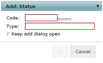
Pick-list Fields
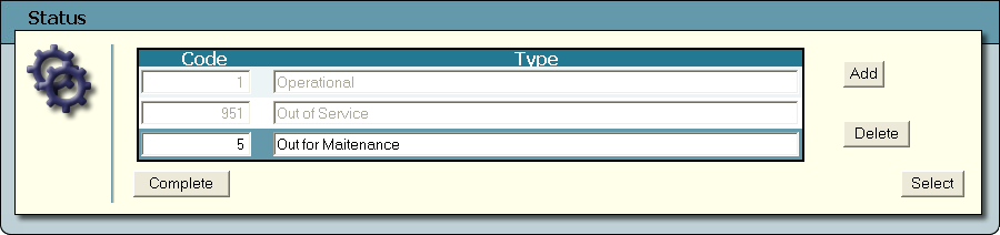
Pick-lists allow users to select a value from a predefined list. Lucity pick-lists often consist of two fields: One contains a Code and the other a Description or Type. Sometimes the available values are carried over from another module (e.g., assets lists, resource options, locations, etc.).
Example
Codes
Numeric - These pick-lists only allow a number in the Code field.
Alphanumeric - These pick-lists allow a mix of numbers and letters in the Code field.
Selectable Values
The values users can select in pick-lists come from one of two sources:
User-defined pick-list - These pick-lists often track an attribute. The values available in these pick-lists are established by the agency using Lucity.
Module-defined pick-list - These pick-lists are used to select a record from another module in the Lucity system. The values available in these pick-lists are automatically populated using data from the related module.
Pick-list Appearance
Single drop-down boxes - A single box that shows both the Code and Description together.
Dual drop-down boxes - Separate boxes for the Code and Description. When the user makes a selection in one field, the system automatically completes the other field.
Text control boxes - An empty text box for the Code and a pick-list button for the Description. Enter the Code and exit the field to automatically populate the Description field, or, click the pop-up button.
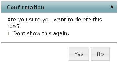
If a user enters invalid data into a pick-list field, an error message appears.
Click on the Pick List button to the right of the field. The following pop-up appears:
To filter for specific data in the pick lists, type the filter criteria in the blank fields at the top of the screen, then click the Filterbutton. The system narrows down the available selections by the criteria entered.
The filter searches for data that either starts with or contains the value entered (depending on system settings). For example, if the user enters "Main" in the Street Name column, the filter finds the first Street record that starts with "Main."
Enter "%[criteria]" to search a field for that criteria anywhere in the field.
Click on the First, Previous, Nextor Lastbuttons to move through multiple pages of options.
Highlight a Street listing and click Select. The highlighted street is added to the pick list field on the form.
 How to use a pop-up pick-list
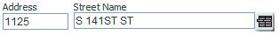
 to the right of the field. The following pop-up appears:
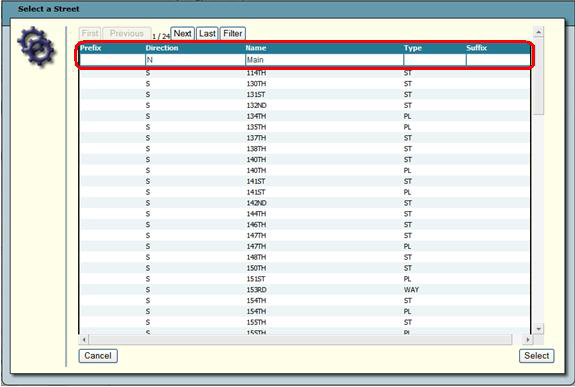
 Requires the Popup Lists - Edit permission for the related module.