Grids display records within a View. They are designed to:
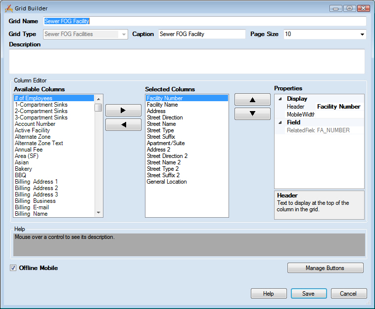
Administrators can use the Grid Builder to control which fields are displayed in a grid, the order in which those fields are displayed, what the grid is called, and which tools appear in the its toolbar.
Header Information |
|
Grid Name |
Provides a unique title for the grid. |
Grid Type |
Indicates which module is associated with the grid. This field is read-only and is based on the program, module and component selected in the Grid Manager. |
Caption |
Displays the text that will appear at the top of the grid in Lucity Web. |
Page Size |
Indicates the number of records that will appear on a page of the grid by default. |
Description |
Explains the purpose of the grid. |
Column Editor |
|
Available Columns |
Lists all columns in the module that can be added to the grid. |
|
Used to move columns back and forth between the Available Columns list and the Selected Columns list. |
Selected Columns |
Lists the columns that are included in the grid. |
|
Used to move a column up and down within the Selected Columns list. Columns, as listed top to bottom, appear left to right in the grid. |
Properties |
Lists the display properties of the selected column. More information about column properties |
Footer |
|
Offline Mode |
Makes the grid available to mobile users when they are offline. |
Manage Buttons |
Opens the Manage Buttons pop-up, which lets administrators choose which buttons appear on the grid's toolbar. |
Save |
Saves all edits and closes the Grid Builder. |
Cancel |
Closes the Grid Builder without saving edits. |
|
In This Section |
 How to add columns
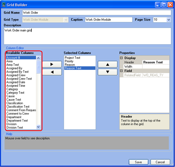 : When creating or editing Work Order grids, a System ID 1 and a set of address fields appear in the Available Columns list. These fields are automatically populated with the first asset ID number in the Asset grid, and first Address from the Location grid. By including these fields, administrators have a way to add some asset and address information directly into the Work Order grid so users don't have to drill down on every record to see the location of the Work Order.