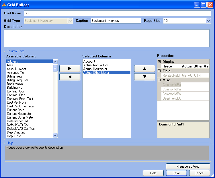
Grids display the records that fall within a view. They are designed to provide a quick look at key information from multiple records in a module and provide a quick link into a more detailed form view of a record.
The Grid Builder gives administrators control over which fields are displayed, the order they are displayed in, what they are called, and which tools show up in the toolbar.
Header Information |
|
Grid Name |
A unique name for the grid |
Grid Type |
The module that the grid is for. This is read-only and is based on what program, module and component were selected in the Grid Manager. |
Caption |
The text that will appear at the top of the grid in the web. |
Page Size |
The default number of records that will appear on a page of the grid. |
Description |
A description of what the grid is for. |
Column Editor |
|
Available Columns |
A list of all columns in the module that can be added to the grid. |
|
These buttons move columns back and forth between the Available Columns list and the Selected Columns list. |
Selected Columns |
A list of the columns which are currently in the grid |
|
These buttons move a column up and down within the Selected Columns list. Columns at the top of the list show up to the left of the grid. |
Properties |
The display properties of the column that is currently selected. More information about column properties |
Buttons |
|
Manage Buttons |
Opens the Manage Buttons pop-up which allows administrators to control which buttons appear on the toolbar of the related grid. |
Save |
Saves all edits and closes the Grid Builder. |
Cancel |
Closes the Grid Builder without saving Edits |
 How To Add columns
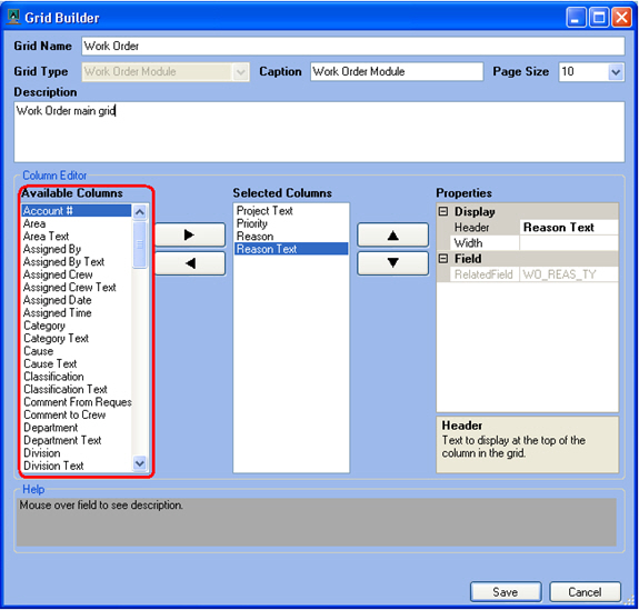 e: For Work Order grids there is a System ID 1 and set of address fields that show up in the Available Columns list. These fields are automatically populated with the first asset id number in the asset grid, and first address from the location grid. This provides a way to add some asset and address information directly into the Work Order grid so users don't have to drill down on every work order to see where the work order is.